Embedded Tools
Add small buttons inside a control adding custom functionality.
Last updated
Add small buttons inside a control adding custom functionality.
Last updated
Several controls in Wisej support the Tools property, which allows an application to "insert" custom tool buttons inside the control. It's an extremely efficient way to build flexible and modern controls in a web application.
Tool buttons can be located to the left or right of the target control, can be enabled or disabled, can automatically hide when the control loses the focus, can be always hidden, can be toggled on or off, and can have their own tooltip.
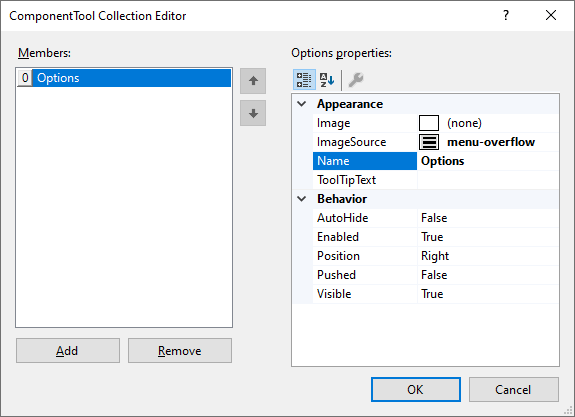
Image and ImageSource indicate the icon of the tool.
Name is the name that your app can use to identify which tool has been clicked when handling the ToolClick event.
ToolTipText shows a tooltip when the pointer is over the tool.
AutoHide hides the tool when the target control is not focused.
Enabled can enable or disable the tool.
Position indicates where inside the control to locate the tool.
Pushed sets the theme state of the tool to "pushed".
Visible can show or hide the tool.
When a control has the Tools property it also implements the ToolClick event. Some controls implement the additional ToolPosition property allowing the application to move the tools to the Top, Bottom, Left (vertical layout), or Right (vertical layout).
These controls support the Tools system in the predefined position, inside the control.
TextBox
TagTextBox
MaskedTextBox
DateTimePicker
ComboBox
ListBox
TreeView
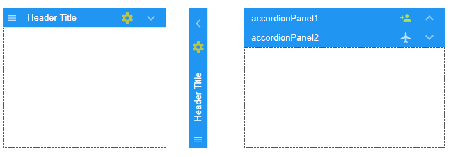
Panels support the Tools system only when the header is visible, and automatically change the orientation of the tools when the panel is collapsed to the left or right side:
Panel
FlowLayoutPanel
TableLayoutPanel
FlexLayoutPanel
AccordionPanel
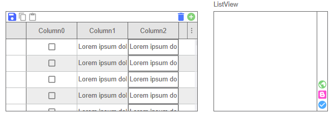
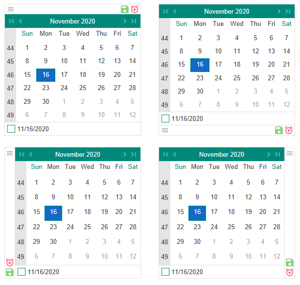
These controls support the Tools system at one of the four positions (Top, Left, Right, Bottom) indicated by the ToolPosition property:
DataGridView
ListView
MonthCalendar
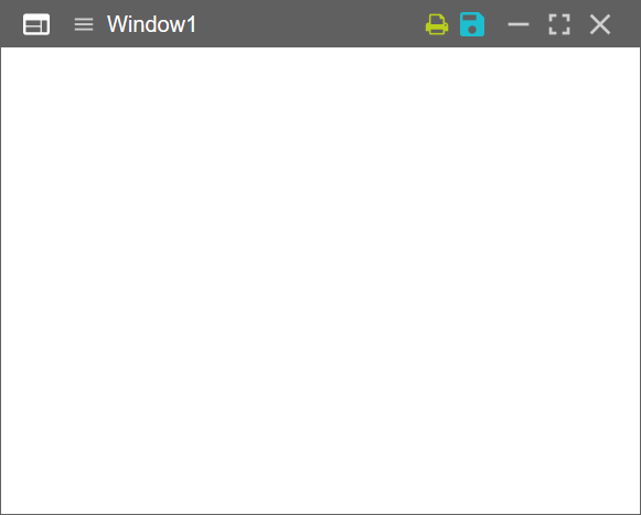
Forms support the Tools system in their caption, next to the standard buttons.
Tools are styled independently in the theme. You can, however, style the container of the tools and the child tool icons depending on where they are used.
The container of the tools uses the "toolcontainer" appearance and its child buttons use the "toolcontainer/button" appearance. In addition to the default states, the control that implements the tools adds these states, allowing the theme to adapt the tool container to the type of control:
Control | State |
---|---|
Form | "caption" |
Panels | "panel" |
Editors | "editor" |
ListBox | "listbox" |
DataGridView | "datagrid" |
MonthCalendar | "calendar" |
ListView | "listview" |
TreeView | "treeview" |
When the toolcontainer is positioned to the Top or Bottom it_ _also has the state "horizontal", when it's positioned to the Left or Right, it has the state "vertical".
All the controls that support the Tools system, also implement the ToolClick event. When you handle the ToolClick event you can determine which tool was clicked by testing the Name property.
If you add the tools programmatically, you can also detect the clicked tool by comparing the e.Tool reference.