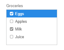
CheckedListBox

Displays a ListBox in which a check box is displayed to the left of each item.

The Wisej.Web.CheckedListBox is based upon the Wisej.Web.ListBox control but includes a checkbox on the left side of each list item.

For a full list of properties, methods and events see the API documentation.

Features

Checkbox

Each item within the CheckedListBox control has a checkbox on the left side of it.
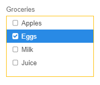
Similar to DisplayMember, ValueMember, etc. The CheckedListBox control contains a property, CheckStateMember, that defines the property of the data source or list that sets the check state for each item.

The CheckOnClick property of the CheckedListBox control can also be set to accept check state changes on a list item.

How To

Apply Checkboxes

Adding Checkboxes to the CheckedListBox control is easy. See the following code snippet:

private void Page1_Load(object sender, EventArgs e)
{
			var myGroceries = new List<dynamic>() {
				new { name = "Eggs", price = 1.00, purchased = true },
				new { name = "Apples", price = 0.50, purchased = false },
				new { name = "Milk", price = 2.00, purchased = true },
				new { name = "Juice", price = 3.00, purchased = false }
			};

			this.checkedListBox1.DataSource = myGroceries;
}

The above code snippet results in:

Advanced

JavaScript Widget

ItemDescription

Class name

wisej.web.CheckedListBox for the CheckedListBox. wisej.web.listbox.ListItem for each list box item.

Theme appearance

"list", "listitem" for the items in the list box. See Themes.

ListBox child components

"scrollbar-x" is the horizontal scrollbar and "scrollbar-y" is the vertical scrollbar. See JavaScript.

List Item child components

"checkbox" is the checkbox shown in each list item. "icon" is the icon shown in each list item. See JavaScript.

ToolContainer state

"listbox", see Embedded Tools.

Source code

Last updated