LogoLogo
HomeNewsSupportVideos
  • Introduction
  • Getting Started
  • What's new in 4.0
    • Known Issues
    • .NET Core Designer
    • Managed Graphics
    • Fluent Markup
    • Markdown Support
    • Upgrade from 3.x
  • Releases
    • What's new in 4.0
    • What's new in 3.5
    • What's new in 3.2
      • View Builder
      • Validation Rules
      • Enhanced Font Support
      • Design-Time Debug
    • What's new in 3.1
    • What's new in 3.0
      • FAQs
      • Update Existing Projects
      • Multi Targeting
      • Visual Studio Designer
      • Referencing Assemblies
      • Docker Support
      • Troubleshooting
      • Deployment
    • What's new in 2.5
    • What's new in 2.2
    • What's new in 2.1
    • What's new in 2.0
    • Upgrade from 1.x
  • Getting Started
    • New Project
    • Templates
    • Troubleshooting
    • License Activation
    • FAQ
    • API
    • Hybrid
    • Deployment
    • Theme Builder
  • Concepts
    • Startup
    • Configuration
    • Load Balancing
    • Designer
    • Layouts
    • Client Profiles
    • Tab Order
    • Compression
    • Embedded Resources
    • Modal Workflow
    • Localization
    • RightToLeft
    • Background Tasks
    • Real Time Web Applications
    • JavaScript
    • JavaScript Object Model
    • Security
    • Synchronization
    • Session Management
    • Theming
    • Dependency Injection
    • Application Switches
    • Visual Studio Code
  • Controls & Components
    • General
      • Application
      • AutoSizing
      • AutoScroll
      • AutoScaling
      • Accessibility
      • Colors & Fonts
      • Embedded Tools
      • Events
      • Touch Events
      • Images
      • Labels
      • ToolTips
      • Data Binding
      • Common Properties
      • Custom Painting
      • Move & Resize
      • Drag & Drop
      • Validation
      • User Data
      • Responsive Properties
      • VB.NET Extensions
    • Common Dialogs
      • FolderBrowserDialog
      • ColorDialog
      • OpenFileDialog
      • SaveFileDialog
    • Editors
      • TextBox
        • TagTextBox
        • MaskedTextBox
        • TypedTextBox
      • DateTimePicker
      • MonthCalendar
      • TimeUpDown
      • DomainUpDown
      • NumericUpDown
      • TrackBar
    • Buttons
      • Button
      • SplitButton
      • CheckBox
      • RadioButton
    • Containers
      • Page
      • Form
      • Desktop
      • Panel
      • FlexLayoutPanel
      • FlowLayoutPanel
      • TableLayoutPanel
      • GroupBox
      • Accordion
      • TabControl
      • UserPopup
      • UserControl
      • ToolBar
      • StatusBar
      • SplitContainer
      • SlideBar
    • Lists & Grids
      • ComboBox
        • UserComboBox
        • TreeViewComboBox
        • ListViewComboBox
      • ListBox
        • CheckedListBox
      • TreeView
      • ListView
      • DataGridView
        • Column
        • TextBoxColumn
        • ButtonColumn
        • LinkColumn
        • ImageColumn
        • MaskedTextBoxColumn
        • DateTimePickerColumn
        • NumericUpDownColumn
        • CheckBoxColumn
        • ComboBoxColumn
      • DataRepeater
      • PropertyGrid
    • Extenders
      • Animation
      • ToolTip
      • ErrorProvider
      • Rotation
      • StyleSheet
      • JavaScript
    • Media
      • Audio
      • Video
      • FlashPlayer
    • Content
      • Label
      • LinkLabel
      • PictureBox
      • ScrollBars
      • Upload
      • AspNetPanel
      • ImageList
      • PdfViewer
      • ProgressBar
      • Spacer
      • Widget
      • WebBrowser
      • IFramePanel
      • HtmlPanel
      • Canvas
      • Shape
      • Line
    • Menus
      • MainMenu
      • MenuBar
      • MenuItem
      • LinkMenuItem
      • ContextMenu
    • Notifications
      • AlertBox
      • MessageBox
      • Toast
    • Other Components
      • Timer
      • BindingSource
      • BindingNavigator
      • DataSet
      • EventLog
      • MessageQueue
      • PerformanceCounter
Powered by GitBook
On this page
  • Features
  • Label
  • Data Binding
  • Selection Modes
  • Lazy Loading
  • Virtual Scrolling
  • How To
  • Populate a List
  • Add an Icon
  • Format a String
  • Advanced
  • JavaScript Widget

Was this helpful?

Export as PDF
  1. Controls & Components
  2. Lists & Grids

ListBox

Represents a control to display a list of items.

PreviousListViewComboBoxNextCheckedListBox

Last updated 2 years ago

Was this helpful?

The control displays a list of strings or data-bound values, allowing the user to select one or multiple options.

For a full list of properties, methods and events see the .

Features

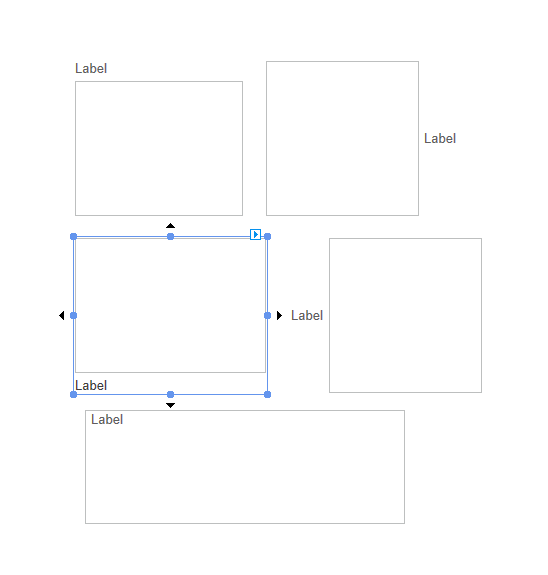
Label

The ListBox control supports the inline property. This allows an application to set a label in relation to a ListBox control without having to create an additional Label control.

Data Binding

In addition to binding the value (Text, or SelectedItem or SelectedValue bindable properties), the ListBox control also supports data binding to populate the list using the DataSource property in conjunction with the DisplayMember, ValueMember, ToolTipMember and IconMember properties.

You can use DisplayMember, ValueMember, ToolTipMember and IconMember to name which properties to use from objects in the ListBox.Items list without binding to a DataSource.

When the ShowToolTips property is set to true, the ComboBox control uses the name specified in the ToolTipMember to read the tooltip text to display next to each item in the drop down list.

Selection Modes

The ListBox control allows users to define one of several different selection modes for the control's configuration.

Selection Mode
Description

None

No items can be selected.

One

Only one item can be selected.

MultiSimple

Multiple items can be selected.

MultiExtended

Multiple items can be selected, and the user can use the SHIFT, CTRL, and arrow keys to make selections.

You can see the different configuration options shown below.

Lazy Loading

The ListBox control includes lazy loading support. Lazy loading works by sending the minimum number of records to the browser that is required for display within the control.

Lazy loading will significantly reduce waiting times related to rendering on the browser and network congestion caused by transferring large datasets from the server to the client (browser).

Virtual Scrolling

The ListBox control has the ability to use virtual scrolling, a feature that only renders the list items currently visible in the browser.

Using this option can drastically reduce the amount of time spent rendering in the browser for large datasets. For a List containing 25,000 strings, the effect will be a noticeable difference of several seconds.

Try the following sample code to test the loading times:

private void Page1_Load(object sender, EventArgs e)
{
	var myList = new List<string>();
	
	for (int i=0; i<25000; i++)
	{
		myList.Add($"String {i}");
	}

	this.listBox1.VirtualScroll = true;
	this.listBox1.DataSource = myList;
}
Private Sub Page1_Load(object sender, EventArgs e) Handles Page1.Load

	Dim myList As New List(Of String)
	
	For i = 0 To 25000
		myList.Add($"String {i}")
	Next

	Me.listBox1.VirtualScroll = true
	Me.listBox1.DataSource = myList
	
End Sub

How To

Populate a List

There are a few different ways to populate a ListBox control.

You can add a list of strings using the Items property of the ListBox control.

private void button1_Click(object sender, EventArgs e)
{
	this.listBox1.Items.AddRange(new[] {
		"Eggs",
		"Milk",
		"Carrots"
	});
}
Option Strict Off

Private Sub Button1_Click(sender as Object, e As EventArgs) Handles Button1.Click

	Me.listBox1.Items.AddRange({
		"Eggs",
		"Milk",
		"Carrots"
	})
	
End Sub

Alternatively, you can assign a list of items using the DataSource property of the control.

private void button1_Click(object sender, EventArgs e)
{
	var myList = new List<dynamic>()
	{
		new { id = 1, name = "John" },
		new { id = 2, name = "Jane" },
		new { id = 3, name = "Sally" }
	};

	this.listBox1.ValueMember = "id";
	this.listBox1.DisplayMember = "name";
	
	this.listBox1.DataSource = myList;
}
Option Strict Off

Private Sub Button1_Click(sender as Object, e As EventArgs) Handles Button1.Click
{
	Dim myList As New List(Of Object) From
	{
		New With { .id = 1, .name = "John"},
		New With { .id = 2, .name = "Jane"},
		New With { .id = 3, .name = "Sally"}
	}

	Me.listBox1.ValueMember = "id"
	Me.listBox1.DisplayMember = "name"
	Ne.listBox1.DataSource = myList
	
End Sub

When assigning a list of complex objects to the DataSource or Items property, the objects will be converted into their string representations for display in the ListBox control unless the DisplayMember property is set.

Add an Icon

Icon

Building off of the previous code snippet, it is easy to add an icon to the ListBox items.

private void button1_Click(object sender, EventArgs e)
{
	var myList = new List<dynamic>()
	{
		new { id = 1, name = "John", icon = "Images/People/1.png" },
		new { id = 2, name = "Jane", icon = "Images/People/2.png" },
		new { id = 3, name = "Sally", icon = "Images/People/3.png" }
	};

	this.listBox1.IconMember = "icon";
	this.listBox1.DisplayMember = "name";
	this.listBox1.DataSource = myList;
}
Option Strict Off

Private Sub Button1_Click(sender as Object, e As EventArgs) Handles Button1.Click
{
	Dim myList As New List(Of Object) From
	{
		New With { .id = 1, .name = "John", .icon = "Images/People/1.png" },
		New With { .id = 2, .name = "Jane", .icon = "Images/People/2.png" },
		New With { .id = 3, .name = "Sally", .icon = "Images/People/3.png" }
	}

	Me.listBox1.IconMember = "icon"
	Me.listBox1.DisplayMember = "name"
	Ne.listBox1.DataSource = myList
	
End Sub

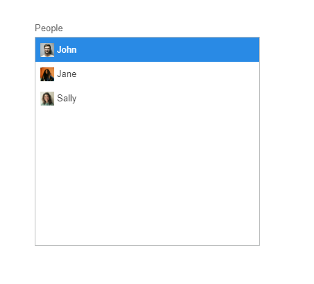
IconMember, DisplayMember, ToolTipMember, and ValueMember retrieve and set the properties of the clicked data-bound item to use for the icon, text to display, tooltip text, and click value, respectively.

The icon paths specified in each object refer to the location of the image relative to the root of the project.

The above code will result in something similar to the following:

Format a String

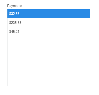
If you are working currencies, dates, or other forms of data, you might want to utilize the FormatString property of the ListBox control.

private void button1_Click(object sender, EventArgs e)
{
	var myList = new List<dynamic>()
	{
		new { id = 1, name = "John", payment = 32.53 },
		new { id = 2, name = "Jane", payment = 235.53 },
		new { id = 3, name = "Sally", payment = 45.21 }
	};

	this.listBox1.FormatString = "C2";
	this.listBox1.FormattingEnabled = true;
	this.listBox1.DisplayMember = "payment";
	this.listBox1.DataSource = myList;
}
Option Strict Off

Private Sub Button1_Click(sender As Object, e As EventArgs) Handles Button1.Click

	Dim myList As New List(Of Object) From
	{
		New With { .id = 1, .name = "John", .payment = 32.53 }
		New With { .id = 2, .name = "Jane", .payment = 235.53 }
		New With { .id = 3, .name = "Sally", .payment = 45.21 }
	}

  Me.listBox1.FormatString = "C2"
	Me.listBox1.FormattingEnabled = true
	Me.listBox1.DisplayMember = "payment"
	Me.listBox1.DataSource = myList
	
End Sub

You only need to specify FormattingEnabled = true when using a DisplayMember.

The result will look something like this (dependent on system currency):

Advanced

JavaScript Widget

Item
Description

Class name

wisej.web.ListBox for the ListBox. wisej.web.listbox.ListItem for each list box item.

Theme appearance

ListBox child components

List item child components

ToolContainer state

Source code

Data binding is fully supported, including formatting and conversion of the value, through the default infrastructure.

"list", "listitem" for the items in the list box, see .

"scrollbar-x" is the horizontal scrollbar and "scrollbar-y" is the vertical scrollbar. See .

"checkbox" is the list item's checkbox. "icon" is the list item's icon. See .

"listbox", see .

Labels
data binding
Data Binding
Themes
JavaScript
JavaScript
Embedded Tools
https://github.com/iceteagroup/wisej-js
Wisej.Web.ListBox
API documentation
Label